
Will we actually finish this sprint on time? The question usually lands when the team least expects it.
In moments like these, the backlog seems bigger than it did yesterday, deadlines are pressing harder, and without anyone noticing, the scope has grown out of shape. According to the 17th State of Agile Report, 41% of teams struggle with inadequate leadership support, which makes it even more challenging to track progress.
This is where a burn up chart proves its worth. It provides a live picture that makes it abundantly clear what has already been done and what still needs attention in a project. In this guide, we’ll walk through what a burn up chart really is, why it helps so much in fast-moving projects, and how you can create one to keep your sprints steady and on track.
What is a burn up chart?
A burn up chart is a visual tool in Agile project management that measures your team’s progress toward completing a project or sprint against the total scope of the assignment. It is also designed to adjust instantly to workflow changes and expansions. Burn up charts are often used in Agile software development to track progress, forecast completion dates, manage stakeholder expectations, and assess team efficiency.
A software team is building a new product and must add a feature mid-project, which increases the total scope. A burn up chart will graphically show the completed work line inching up, while the total scope line rises with the added feature. The team can then forecast a new completion date based on their current rate of completing work and the new, larger total scope.
Understanding the meaning of a burn up chart
Unlike static reports that only track completed tasks, a burn up chart allows Agile teams to track how much work is already done and how much remains almost instantly. By presenting both progress and scope together, it provides a transparent view that reflects the project’s progress. For example, a Scrum team at an SaaS company can utilize a burn up chart to track their project and keep everyone aligned.
Components of a burn up chart
It’s important to understand the various components that make up a burn up chart as well as their usefulness to different teams. The three key elements that define a burn up chart are:
- X-axis (Time): Represents the timeline, typically in days, weeks, or sprints.
- Y-axis (Work): Measures work in story points, hours, or tasks.
- Lines: Two lines are plotted:
- Completed work line: Shows cumulative work finished over time.
- Total scope line: Represents the total work required for the project.
Knowing the composition of a burn up chart is just the starting point. The real value lies in combining them into a chart your team can use.
How to create a burn up chart?
To ensure a burn up chart will serve as a guide your team can rely on, learning how to build it properly is important. It is created through a systematic process and is designed to map your project’s progress and track any changes in near real-time. This includes:
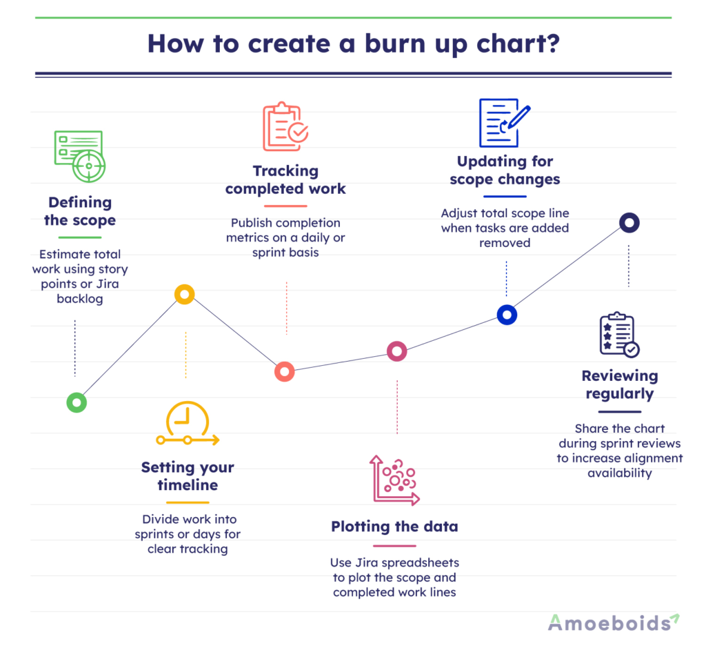
Defining the scope:
This is the starting point where you estimate the total amount of work. You can use story points or task counts from your Jira backlog.
Setting your timeline:
The next step is to break the project into clear time blocks, like days or sprints. This gives your chart structure and makes progress easier to track.
Tracking completed work:
Ensure you update daily or per sprint with metrics on completed work.
Plotting the data:
Use a spreadsheet or Jira to plot the completed work and total scope lines.
Updating for scope changes:
This is not a one-time activity. You would need to adjust the total scope line for new or removed tasks.
Reviewing regularly:
Don’t forget to share the chart in sprint reviews to maintain team alignment and transparency.
Now that you can create a chart, let’s explore how to read it.
How to read a burn up chart?
You interpret a burn up chart by analyzing the relationship between its two plotted lines over a given time period. Correctly reading it involves examining how these elements interact to precisely determine where the team stands in relation to project goals.
When it climbs quickly, you know that your team is delivering tasks at a fast pace. When it rises more gradually, it’s a sign that while the progress is steady, it’s much slower.
The total scope line represents the overall amount of work planned. Now, if it stays flat, you can infer that the scope has not changed. On the other hand, if it rises, it signals that new tasks or requirements have been added.
The space between these two lines represents the work that still needs to be done. As they shrink in size, you know the team is getting closer to completion. By following how these lines shift together, you can see exactly where the team stands in relation to project goals at any point in the sprint.
Now that you’ve learned how to create a burn up chart, let’s see why it’s worth the effort.
What are the benefits of a burn up chart?
According to Amoeboids’ Pulse Survey, 40% of project managers say lack of clarity on goals and milestones is a major reason projects fail. Burn up charts address this by serving as a means to provide a transparent view of both progress and scope in real-time. Their benefits include:
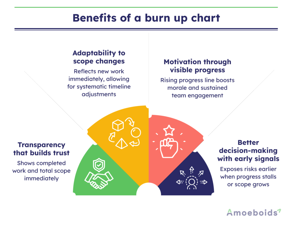
Transparency that builds trust:
A burn up chart allows observers to learn about the amount of completed work as well as the total project scope at a glance. It helps build trust in the process among stakeholders.
Adaptability to scope changes:
When new work is added, the chart reflects it immediately. That visibility means teams can adjust timelines systematically, rather than scrambling at the end.
Motivation through visible progress:
There’s a boost that comes from seeing the completed work line climb higher over time. It serves as a reminder that your team’s efforts are making a difference, which builds momentum and helps keep everyone engaged.
Better decision-making with early signals:
Burn up charts highlight risks early instead of letting them fester. For instance, if the completed work line stalls while the scope continues to grow, it signals a problem that requires immediate attention.
Together, these benefits turn a burn up chart from a simple graph into a decision-making tool — one that fosters alignment, reduces surprises, and helps teams deliver with confidence. But how does a burn up chart stack up against its cousin, the burn down chart?
Burn up vs burndown chart: The differences
Burn up charts and burndown charts both monitor progress, but in opposite directions. A burndown chart tracks the amount of work remaining until the end of a sprint or project. It’s a simple line graph that starts high and falls toward zero as tasks are completed.
Let’s take a look at the main differences between them:
| Aspect | Burn up chart | Burndown chart |
|---|---|---|
| Focus | Cumulative work done and total scope. | Remaining work over time. |
| Scope Changes | Clearly shows scope increases or decreases. | Scope changes are less visible. |
| Visual | Two lines: completed work and total scope. | One line: remaining work. |
| Use Case | Ideal for projects with a changing scope. | Best for fixed-scope sprints. |
When to use burn up chart vs burndown chart?
You don’t need to choose between a burn up chart and a burndown chart to pick which one is better. They both serve different purposes. Hence, the right choice depends on the type of project you’re working on. While they’re often associated with Agile, both charts can be just as useful in any project where keeping progress visible and easy to track matters.
Use a burn up chart when:
- The scope is likely to change. For example, in a product launch where new compliance requirements are added mid-sprint, a burn up chart makes the increase in scope visible without undermining the progress already delivered.
- You need to communicate progress and scope to stakeholders. Because it shows both completed work and total scope together, a burn up chart works well in executive reviews where clarity and alignment are crucial.
- The project is complex with iterative goals. Some assume burn up charts are only useful for large or complicated projects, but even small feature builds benefit from the combined view of scope and delivery. It helps teams avoid confusion when tasks shift midstream.
Use a burndown chart when:
- Scope is fixed. During a five-day bug bash with a locked list of defects, a burndown chart provides a straightforward countdown to zero, helping the team stay focused.
- You want to focus only on reducing the remaining work. Burndown charts are effective in regression testing cycles where the scope remains constant and the team’s sole goal is to complete the defined list.
- Simplicity is key for alignment. Some see burndown charts as too basic for large projects, but their simplicity can be a strength. During multi-team release hardening weeks, a burndown chart provides a clear overview of the work that remains to be done for everyone.
Conclusion
Burn up charts bring structure to the uncertainty that often surrounds projects. By learning how they work, from the core elements to the correct interpretation and construction, teams can rely on the chart as a steady guide rather than just another report. You’ve seen how they highlight steady delivery, reflect shifting workloads, and help managers step in before issues spiral. You’ve also been shown how they compare with burn down charts, and that both tools have their place. The difference is not about which is better, but about which fits the situation at hand.
Start using burn up charts in your next sprint, and you’ll notice how much smoother collaboration and delivery can feel.
FAQs
Q1: How do you read a burn up chart?
Track the completed work line for progress, check the total scope line for changes, and measure the gap for remaining work. A steep completed work line shows fast progress; a rising scope line indicates added tasks.
Q2: What is the difference between a burn up chart and a burn down chart?
A burn up chart shows cumulative work completed alongside total scope. A burn down chart tracks only the remaining work until completion.
Q3: Can burn up charts be used in Agile or Scrum projects?
Yes, burn up charts are widely used in Agile and Scrum. They help ensure transparency, keep teams and stakeholders aligned, and integrate smoothly with tools like Jira.