Ever wondered why some project status reports get noticed while others go unnoticed by your team? The secret often lies in how they communicate progress.
In project management, turning complex data into clear insights is key.
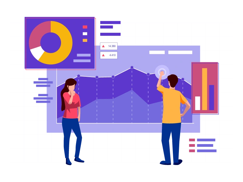
That’s where visuals come in, adding clarity and making even the most intricate details engaging.
A well-chosen chart or graphic can speak volumes, transforming dry data into a compelling story. A picture is worth a thousand words – heard this one before?
As projects grow more complex, effective visuals can turn status reports into powerful tools for alignment, keeping teams, stakeholders, and decision-makers fully informed and focused.
Let’s learn how visuals can take your reports from overlooked to unforgettable.
Why project status reports matter?
Project status reports are essential for ensuring clear communication across teams, management, and stakeholders. They align everyone on project progress and challenges, making it easier to make timely & informed decisions.
But traditional reports, often packed with dense text, can overwhelm readers, burying the details that matter.
Visuals—like timelines, graphs, and charts—can streamline these reports, highlighting crucial information in a way that’s easy to grasp at a glance.
By using visuals, you don’t just make reports more efficient; you also ensure key insights are noticed and acted upon.
Why overwhelm with text when a well-placed visual can tell the story just as clearly?
The power of visuals in communication
Visuals have a unique power to simplify complex information, making it easier for teams to understand and remember key points.
Studies show that people retain around 65% of information presented visually, compared to just 10% through text alone.
That makes visuals a game-changer for conveying complex project data.
With tools like charts, infographics, and timelines, organizations can transform dense data into clear insights, enabling quicker understanding and more confident decision-making.
Visuals also cater to different learning styles, increasing engagement and helping stakeholders connect more deeply with the message.
In short, visuals aren’t just about aesthetics—they’re a critical tool for clarity and communication effectiveness.
Types of visuals to use in project status reports
The right visuals can turn complex project data into compelling stories, bringing clarity and focus to essential project status report elements. Here are some impactful types to consider:
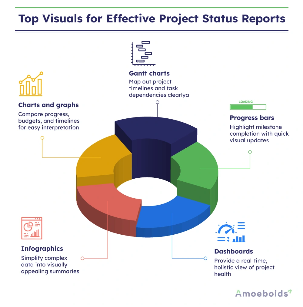
- Charts and graphs: Use line, bar, pie & donut charts to show progress, budgets, and timelines, allowing for quick, clear comparisons.
- Gantt charts: Perfect for visualizing project timelines and dependencies, helping teams see schedules and task relationships at a glance.
- Progress bars: These provide quick updates on key milestones, giving stakeholders an immediate sense of project advancement.
- Infographics: Turn complex data into engaging visuals, making critical insights more accessible and appealing to a variety of audiences.
- Dashboards: Real-time dashboards pull together multiple data points, offering a comprehensive snapshot of overall project health.
Using these visuals not only enhances comprehension but also aligns with the essential elements of a project status report that is effective.
When integrated thoughtfully, they transform raw data into an engaging, informative report that keeps teams aligned and stakeholders informed.
How to integrate visuals effectively in project status reports
Incorporating visuals into project status reports can elevate your communication, but it requires a thoughtful approach.
Here’s how to ensure your visuals make a lasting impact:
- Focus on key metrics: Make visuals meaningful by aligning them with essential project metrics. This allows stakeholders to quickly understand critical data, such as budget use and timeline adherence.
- Select the right visual for the data: Match your data to the best visual format. Line charts highlight trends effectively, while Gantt charts showcase timelines and task dependencies clearly.
- Leverage tools for impact: Use tools like Excel for basic charts, Power BI for interactive visuals, and Canva to create visually appealing infographics. These tools enhance both clarity and engagement in your reports. (Shameless plug – Try our app for automating reports in Jira)
- Prioritize clarity: Keep visuals clean and impactful. Avoid overcrowding by using only a few strategic visuals, and leverage whitespace to maintain readability.
By applying these steps, you’ll turn your project status reports into compelling visual narratives that engage stakeholders and communicate data with clarity. Try these strategies to see the difference in your next report!
Common mistakes to avoid with visuals in project status reports
Finding the right balance is key to effective visual communication. Here are some common mistakes to watch out for, so your visuals stay impactful and clear:
- Overloading with visuals: Including too many visuals can overwhelm readers, making it harder for them to absorb information. Stick to a few key visuals that align with essential metrics to keep the report focused.
- Choosing the wrong type of visual: Every data type has an ideal visual match. Avoid using pie charts for trends or line charts for static comparisons, as this can confuse stakeholders. Instead, choose visuals that best represent your data’s purpose—like using Gantt charts for timelines or bar charts for budget comparisons.
- Complicated visuals without clarity: Visuals that resemble puzzles can end up confusing rather than clarifying. Choose visuals that prioritize readability and simplicity. Ensure major ideas are easy to understand at a glance and emphasize clarity in both design and content.
- Outdated or static data: Old data or static visuals (read copy/paste errors) can mislead stakeholders and reduce your report’s credibility. Regularly update visuals to reflect the latest data or consider using tools with real-time data capabilities where possible. This helps maintain trust and ensures your insights remain relevant.
- Neglecting visual context: Even the best visuals need a little context. Adding brief captions or titles can guide stakeholders in understanding the “why” behind each visual, making your reports more cohesive and impactful.
By avoiding these common mistakes, you’ll ensure that your visuals enhance your project status reports, making them clear, compelling, and reliable sources of information for your team.
Best practices for consistent project status reporting visuals
To make the most of visuals in project status reports, consistency is key. Here are some best practices to ensure that your visual reporting stays effective and aligned with project goals:

- Create a visual reporting template: Design a standardized template for visual elements like charts, timelines, and progress bars. This not only saves time but also ensures your reports have a consistent look and feel.
- Regularly update and refine visuals: Periodically review your visual reporting style to ensure it remains relevant and effective. Update visuals with real-time data where possible and refine them based on feedback from stakeholders.
- Use a visual style guide: Create a guide with color schemes, font sizes, and layout recommendations to keep visuals clear and accessible. A style guide helps maintain clarity and readability, especially when multiple team members contribute to report creation.
- Test for readability and impact: Before finalizing reports, test visuals with a small group to ensure they convey information effectively. Quick testing can help catch any issues with clarity or relevance, ensuring your visuals hit the mark every time.
By following these best practices, you’ll ensure that your project status reports consistently communicate key insights, keeping teams and stakeholders aligned and informed.
Conclusion: Turn your data into actionable insights
Using visuals in project status reports isn’t just about presentation—it’s about driving action.
Effective visuals make complex data clear and memorable, helping your team and stakeholders stay aligned and informed.
From highlighting key metrics to showcasing progress, visuals enhance communication.
By following best practices and avoiding common mistakes, you’ll create reports that stand out and make an impact.
Next time you prepare a report, think visually!
A few well-chosen visuals can transform your data into stories that keep projects on track and teams engaged.