
Release notes are a marketing tool that many teams underutilize – not only do they show how the product has progressed, but they also give customers an idea of how dedicated the development team is.
From detailed versions to neatly designed/humorous ones, release notes come in many shapes and sizes, and here are 55 of them. Analyzed in detail so that you can write the best release notes ever written (and top it again the next time, of course).
What are release notes?
Release notes are a way to communicate changes (with the stakeholders) that have happened in a product since the last release. Release notes typically inform users what’s new, improved, or fixed in a product after the update.
Release notes can come in the form of a presentation, a web page, a word doc or even a video. But the gist is that they are relied to communicate product updates with relevant stakeholders.
Who Is Responsible for Writing Release Notes?
As to many other questions, the answer here is – ‘it depends’.
It depends on the size of the company, type of product, stakeholder persona & a number of other variables. But typically, following stakeholders are usually involved in writing release notes:
- Product Managers: Since they are responsible for driving the product direction they define what features, fixes, or updates need to be communicated to various stakeholders based on the release scope.
- Technical Writers: They will get involved in release notes writing to craft clear, structured, and user-friendly content that is easy to understand.
- Developers/Engineers: If the product involved has a technical element to it, then Developer/Engineers can assist in pinpointing the technical details about new features, bug fixes, and improvements.
- Quality Assurance (QA) Teams: Since they are the gatekeepers of quality, QA teams confirm the accuracy of information and ensure only correct behavior is listed in the release note document.
- Marketing or Customer Support Teams: Based on their customer facing activities, these teams will be able to aid in identifying the ‘highlights’ of the release so that release notes are customer centric.
In short, writing release notes is a collaborative effort but the actual writing is often done by technical writers or product managers, with input from developers and QA.
Key Elements of Great Release Notes
While length, presentations of different release notes can vary based on the audience, usually well-crafted release notes share certain essential characteristics such as:
- Clear Title and Version Information: Clearly indicate the release version and date to help users identify the update.
- Concise Summary: Provide a brief overview of the release, highlighting its purpose or main benefits.
- Detailed Changes: List the updates, improvements, bug fixes, or new features in an organized manner.
- Impact on Users: Explain how the changes affect user experience or workflows.
- Call to Action: Guide users on the next steps, such as exploring a new feature or providing feedback.
Release notes examples are divided into five categories –
- Release notes examples of Software development & collaboration tools
- Release notes examples of Customer support tools
- Release notes examples of Sales & marketing tools
- Release notes examples of Project management tools
- Release notes examples of Renowned daily usage tools
- Release notes examples for other tools
The idea is to cover different aspects of what customers need and highlight how some of the best software products handle them. Release note samples here show multiple variations of release notes and point out what works for them and what can be made better.
Release notes examples of Software Development & collaboration tools
1. GitHub
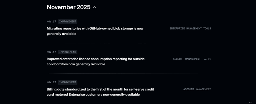
GitHub’s Changelog page is very clear and organised as updates are grouped by month, and each entry is tagged (e.g., Actions, Copilot, Application Security) so users can filter by product area.
The page clearly defines the update types, which are Release, Improvement, and Retired, allowing users to understand the type of change they are looking at. Updates occur frequently, sometimes multiple times in a single day, showing their commitment to being open.
Their recent UI revamp makes the Changelog more user-friendly. The design now resembles GitHub’s main interface, and there are 12 curated tags for filtering.
What to emulate: The clear date segmentation, tags, and categorised updates make navigation simple. Frequent and meaningful releases, as well as an intuitive user interface, ensure that users can scan, understand, and stay informed.
What to avoid: Prevent filling the page with too many tiny updates or one-line fixes that lack context, as these can overwhelm readers.
2. Zoom
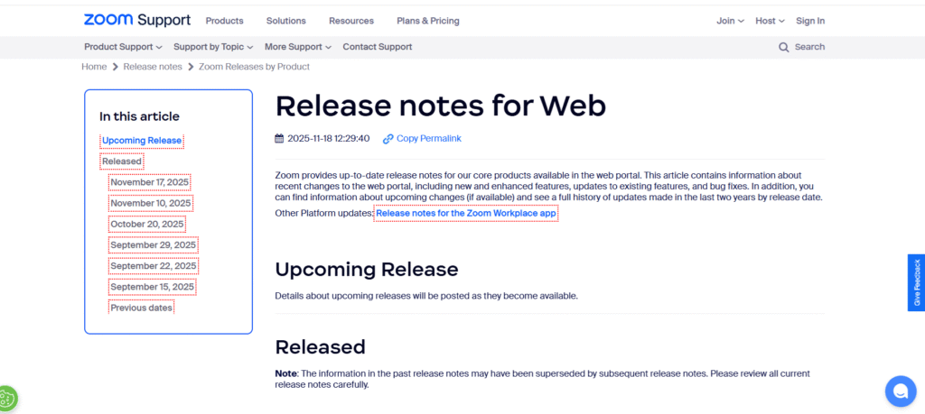
The zoom release notes are complete and regularly updated, with new features, enhancements, UI improvements, and resolved issues. It is presented in a clear and chronological order.
The team practices strong ethics by providing two full years of release history with dates and version numbers, even though the frequency of updates varies.
Each section is neatly categorised, allowing users to quickly scan for changes that are relevant to them. It particularly benefits employees who rely on technical accuracy and detailed records.
What to emulate: The structured separation of new features and resolved issues enhances readership. The “Related Articles” sidebar seamlessly directs users to relevant help topics and in-depth product explanations for recently introduced features.
What to avoid: Listing all release notes on one long page can overwhelm users. A brief summary of key impacts or highlighting major updates would make the information more useful to a larger audience.
Unleash Marketing potential with release notes!

3. Google Cloud
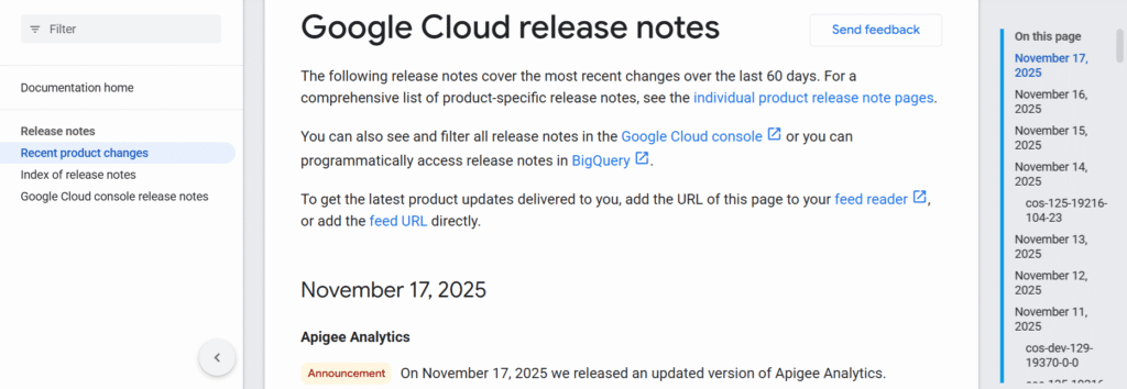
The Google Cloud release notes provide a precise and technically rich record of changes across its entire product portfolio. It categorizes updates by product area, with each entry clearly labeled with the release date and version, allowing admins to quickly see what changed, when, and where.
What to emulate: Its consistent daily (or near-daily) update cadence indicates reliable maintenance and helps build trust. The colour-coded sorting of issues (features, enhancements, and fixes) allows technical readers to scan quickly.
What to avoid: Despite the very granular technical focus, there is frequently little context for what end-users or non-admin stakeholders should expect. This makes it less accessible to a larger audience.
4. Microsoft teams
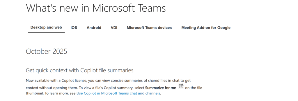
Microsoft Teams lists cumulative enhancements for Teams Rooms on Windows and Android, classifying them by version (e.g., “Introduced in this update”) and indexing them by date/version. Clear version histories are provided (e.g., 5.4.210.0 for Windows, dated 9/29/2025), which include feature introductions and bug fixes.
What to emulate: Detailed version histories simplify admin tracking and rollback decisions, while separating introduced features from resolved issues makes updates clearer and easier to understand.
What to avoid: The notes are highly technical with little user-focused context, and the lack of direct version anchors makes navigating specific releases harder.
5. Slack
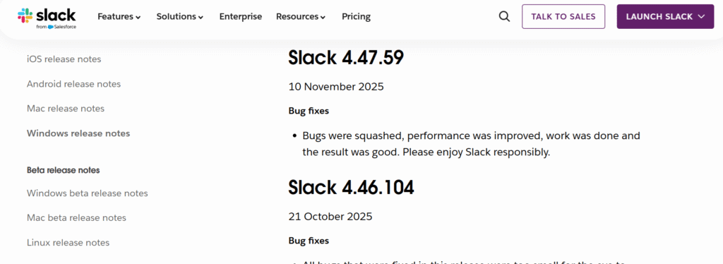
Slack release notes are consistently updated and arranged in a clear, chronological layout, with each version tagged by date.
Most updates focus on enhancing longevity, performance tuning, and routine bug fixes, all delivered in Slack’s signature friendly tone that makes technical changes feel light and approachable.
Though brief, the notes reflect a steady commitment to refining the desktop experience and maintaining reliability for everyday users. The versioned history also allows users to understand how Slack changes over time.
What to emulate: The clean structure, clear versioning, and simple labels such as “Bug fixes” make the updates simple to scan. The natural voice adds charm while keeping clarity.
What to avoid: Many entries are extremely short and lack context for the changes. There are no filters or anchors, so navigating to older updates requires manual scrolling.
6. Asana
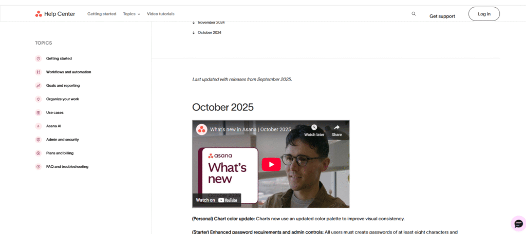
The Asana release notes are clutter-free and user-focused, clearly listing product updates, new features, improvements, and bug fixes.
Each item is grouped by meaningful headers and month, making it simple to track Asana’s development progress and understand what has changed. The language is understandable to both technical and non-technical users, highlighting the product’s range across teams.
What to emulate: The clean segmentation into categories (Starter, Advanced, and Enterprise) simplifies scanning. The blend of technical detail and general clarity ensures updates are useful to a broad audience.
What to avoid: Avoid vague or overly brief entries, each should clearly describe the impact. Try adding direct links to related help articles to guide users to more detailed documentation.
7. Basecamp
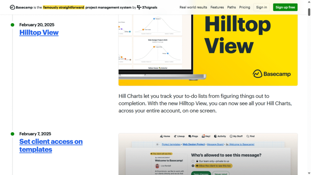
Basecamp’s “What’s New” section offers a clean and engaging overview of its latest features and enhancements. It also displays high-level summaries highlighting productivity, collaboration, and design polish.
The tone stays friendly and conversational, clearly highlighting key improvements while keeping each update simple and accessible to all users.
What to emulate: A conversational tone promotes connection, quick highlights ensure understanding, and a focus on collaboration keeps updates relevant and engaging for all users.
What to avoid: Avoid using overly technical jargon. Don’t confuse the reader with too many brief sentences, and focus on the most impactful changes.
8. Docker
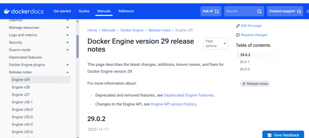
This release includes vital changes such as increasing the API minimum to 1.44, turning on the container-style image store by default, and adding experimental tableau support. It also includes breaking changes, such as renaming Go modules and removing legacy architectures.
These enhancements improve performance and ecosystem alignment, which calls for a thorough review before upgrading.
What to emulate: Clear versioning and simple explanations of major changes help readers understand the implications and plan accordingly.
What to avoid: While long lists of modifications can be overwhelming, a brief summary of user impact would benefit a larger audience.
9. Twilio
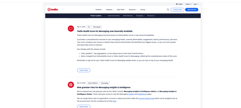
Twilio’s Changelog provides a detailed timeline of platform changes, including new features and overhauls across its APIs and products. The updates are clearly dated and categorized, allowing developers to easily track changes that are relevant to their integration. The language is technical but understandable, with links to detailed documentation or switching guides for further context.
What to emulate: Clear versioning and date-based entries help users monitor changes systematically. Relevant links to docs support smooth integration.
What to avoid: Dense technical entries may confuse non-developer stakeholders, providing a summary of user impact could improve access.
10. Confluence
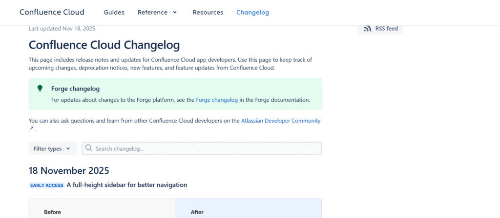
Confluence release notes provide a chronological list of product updates, including new features, enhancements, bug fixes, and retiring endpoints. Each update includes dates and version highlights, as well as links to more detailed documentation for a deeper dive. The entries are technically detailed, pitched primarily at admins and developers who manage Confluence in their organisation.
What to emulate: Structured and date-based entries make tracking changes simple, while detailed documentation links allow users to explore updates in depth.
What to avoid: The highly technical presentation may be complex for non-technical stakeholders, a brief summary of business impact would make the changelog more clear.
11. Segment
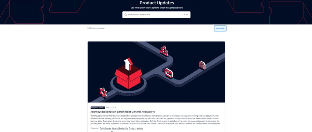
Segment’s Product Updates seems like a continuous bulletin. Every new feature, update, or fix posts as soon as it’s ready, giving teams instant peeks into changes. Each update is date-stamped and clearly titled, making it simple to search for updates related to your data workflows. It shows Segment’s constant progress, from new integrations and API improvements to performance enhancements.
What to emulate: Changes are logged promptly and concisely, with clear headlines to keep users informed
What to avoid: Overly complicated entries that lack plain-language context may confuse users.
12. ReadMe
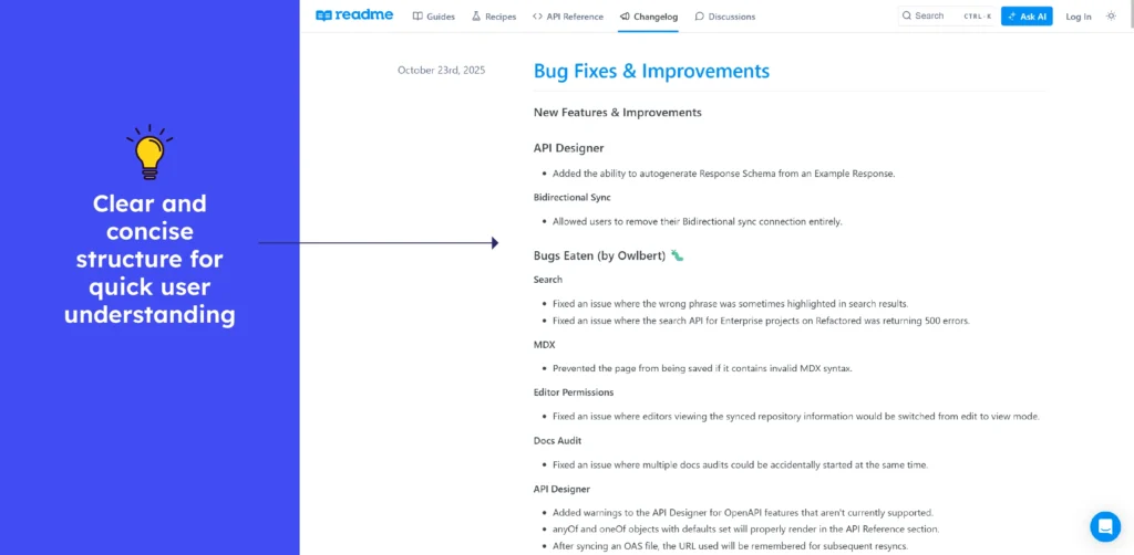
This changelog offers a clean and chronological list of updates, including new features, improvements, bug fixes, and deprecations across its documentation platform. Each entry is clearly dated, allowing developers and documentation teams to monitor changes over time. The entries are brief, but they link to detailed release notes or migration guides for users who require more context.
What to emulate: The date-based pattern and concise entries make changes simple to follow, and links to detailed documentation support the easy integration of updates.
What to avoid: The number of technical entries may appear cumbersome to non-technical stakeholders. Adding brief impact summaries could help make updates more widely understood.
13. Zapier
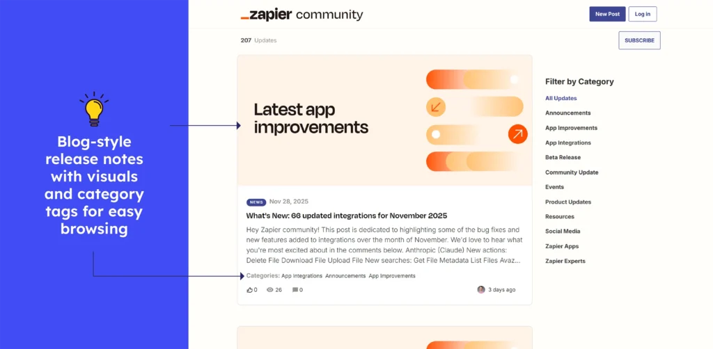
Zapier’s Community “Product Updates” page displays clean and dated update entries, often with large featured images and distinct categories for different update types (bug fixes, new integrations, and improvements). This layout makes it simple to scan what’s new, allowing users to quickly identify significant changes.
What to emulate: Use dated and sorted updates with clear headings and featured images to improve readability and user engagement with release notes.
What to avoid: Don’t bury important details deep in the update. Share key takeaways at the top to help users understand the changes quickly.
14. Figma
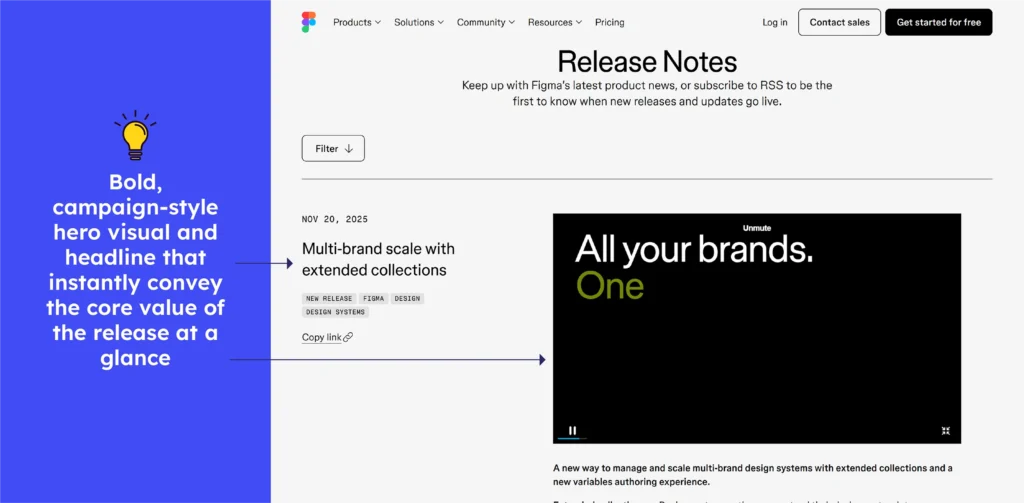
Figma’s Release Notes page displays chronological updates, each tagged with the date and release name, and clearly organized by product area (Design, Dev Mode, Make, Mobile, etc.). Recent entries discuss features such as extended collections for scalable design systems, multi-account mobile support, accessibility enhancements, and improved vector editing.
What to emulate: Figma’s clean segmentation by product area, paired with short and outcome-focused descriptions. It helps readers instantly understand where each update fits in their workflow.
What to avoid: Key improvements can be lost in long scrolls, so highlight major enhancements first to save time and help users understand priority changes more quickly.
15. Miro
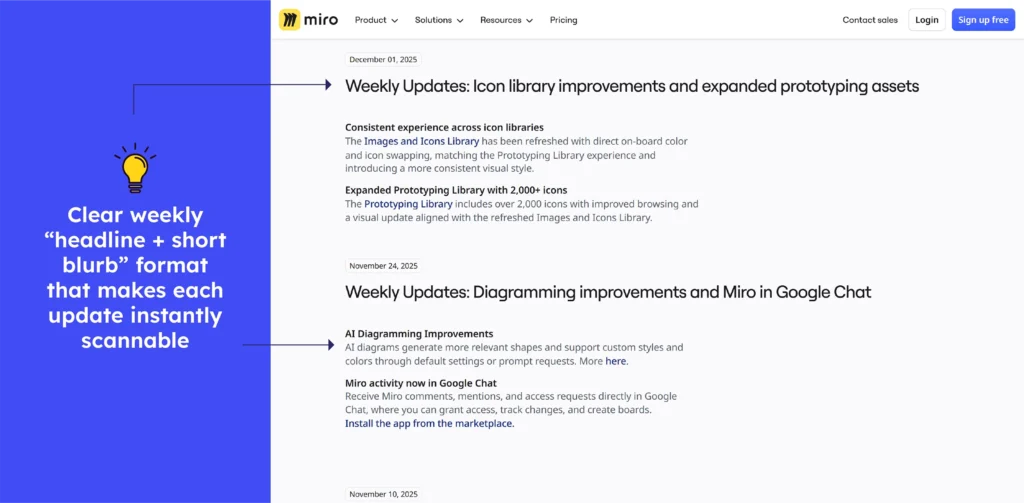
Miro’s changelog delivers weekly updates with clear dates, distinct sectioning by feature type, and short summaries that highlight what changed. The layout helps users scan for relevant updates easily.
What to emulate: Segmenting by topic and using short points allows readers to quickly find what is important to them, improving clarity and usability.
What to avoid: Don’t let important changes get lost in lengthy lists. Without a quick “major impact” indicator, new features or breaking changes are easy to miss.
Release notes examples of Customer Support Tools
16. Help Scout
The Helpscout changelog contains a clear and arranged sequence of updates, including new features, improvements, and deprecations, along with version numbers and dates.
This allows developers to easily evaluate changes to endpoints, request formats, and behavioral tweaks over time. Detailed release notes include precise API modifications, backward-compatibility notes, and migration guidance to help with smooth integration.
What to emulate: Clear versioned entries with dates allow reliable tracking, while technical detail ensures developers can assess impact and apply updates correctly.
What to avoid: Don’t rely on raw API jargon or bare technical entries. Missing impact context or simple summaries leaves readers puzzled.
17. Zendesk
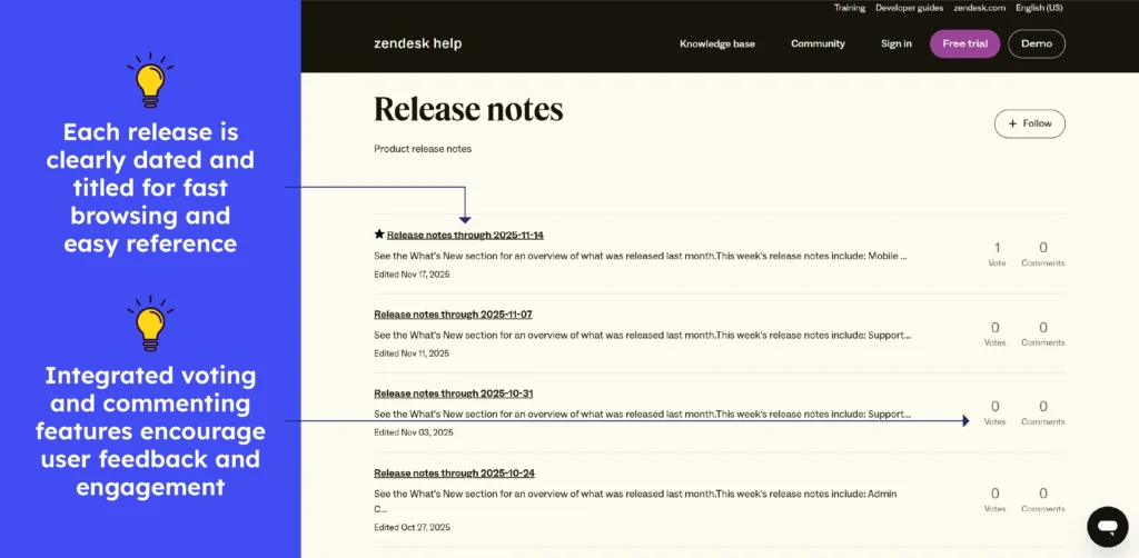
The Zendesk Release Notes are a living record of change. Each tweak, update, and new feature is documented with dates and a short summary. From support-flow upgrades to UI polish, each entry provides developers and administrators with a quick overview of what’s new and improved. It’s less a formal changelog and more a “what’s fresh” feed for anyone using Zendesk. It also has a vote and comment feature.
What to emulate: The consistent updates and clear, date-based entries make it simple to see what has changed. The informal and easy-to-read style keeps even non-technical teams informed.
What to avoid: Some notes are brief and require clicking multiple links for details. Keeping important context on the same page would improve readability.
18. ServiceNow
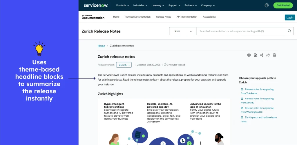
ServiceNow’s Zurich release notes can be thought of as a dynamic changelog journal, with several feature updates, bug fixes, and enhancements gathered under a single release.
Delivers structured entries by module and release date, helping admins trace what’s new, what’s improved, and what’s old across the platform. Each release feels like unpacking a new toolbox of capabilities.
What to emulate: Module-based grouping and clear version tags make scanning easier, while combined enhancements in each release reveal the overall impact immediately.
What to avoid: Where entries are concise or technical, it can be difficult to recognise them. A brief, plain-language summary of “why this matters” would help in understanding the change.
19. Intercom
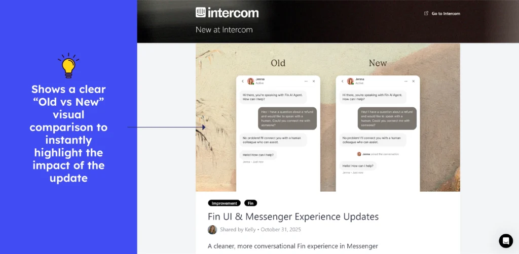
Intercom’s “Changes” functions as a live product journal, providing timely, date-tagged updates on new features, improvements, and fixes. It allows teams to remain aligned, informed, and aware of how the platform evolves over time.
What to emulate: The immediate and clear update log provides confidence and trust, while date-tagged entries make tracking simple.
What not to do: Avoid combining major updates with minor changes in the same stream. Without a visual structure, significant improvements can be overshadowed or easily overlooked.
20. Freshdesk
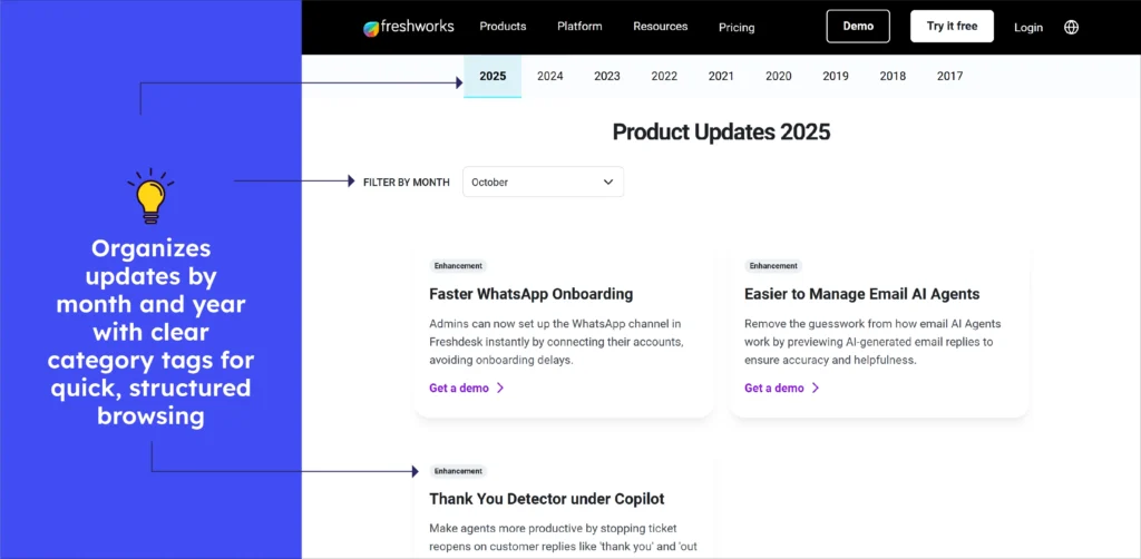
Freshdesk’s “New Features” is a live update stream, displaying new additions and improvements alongside clear and filtered month- and year-tagged entries. It’s easy to scan, highlights changing product value, and keeps support teams instantly aware of what’s new or enhanced.
What to emulate: The timely, accurate, and modified update feed increases confidence and allows users to easily track progress.
What to avoid: Non-tech stakeholders would benefit from short headlines with a line or two about the actual impact.
21. Front
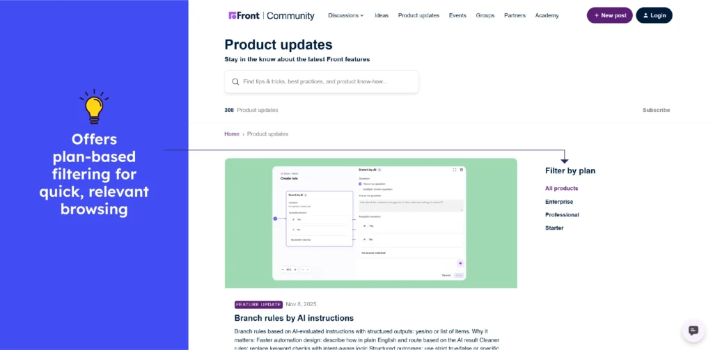
Front’s Product Updates feels like a live bulletin board for teams, with each new release and feature update as a fresh post, giving users immediate insight into what’s changed.
Entries are clearly dated and grouped, making it simple to scan for changes that affect workflows or communication. The page clearly tracks Front’s evolution, whether it’s a UI change, a new integration, or a performance enhancement.
What to emulate: Regular and visible updates foster trust and enable users to plan. Clear date tags and understandable headlines make tracking simple.
What not to do: Avoid update posts that require you to click through multiple pages to gain context. Keeping important details visible upfront improves flow and saves time.
22. Aircall
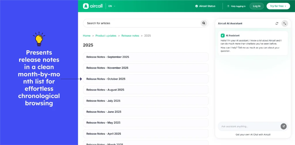
Aircall’s updates are a dynamic product diary, with each new feature and improvement as a new update, providing users with an instant snapshot of what’s improved.
Each entry wears a date tag, making it simple to click and scroll and spot something relevant to your workflows or integrations. Easily track Aircall’s evolution, from interface tweaks and performance enhancements to new features.
Think of it as a “pulse check” on your call platform, keeping teams synced and aware of how Aircall is advancing to help them better.
What to emulate: Frequent and visible updates give confidence and clarity, and dated labels make changes easy to track.
What to avoid: When entries stay technical, users may miss the purpose. A short layman’s explanation would help to broaden understanding.
23. Salesforce
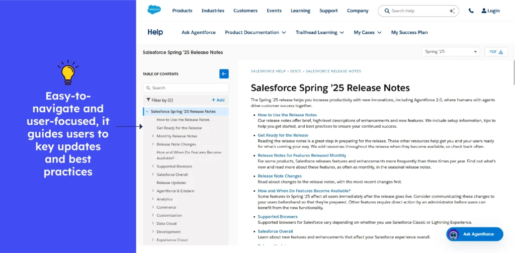
Salesforce’s Release Notes are refined as seasons, with each new feature, upgrade, or patch stamped with a release number and date, allowing users to easily track the platform’s evolution.
Each entry discusses what’s new, improved, tips, or out of date, often affecting multiple features and tools. It provides admins and users with a broad overview of what is changing. It’s like unwrapping a new update bundle with each release cycle.
What to emulate: The detailed year- and season-tagged entries make tracking simple, while grouped changes help users understand the platform’s overall impact.
What to avoid: Don’t bundle many features under dense text. Missing summaries make key updates hard to spot, especially across Salesforce’s three yearly releases.
24. Liveagent
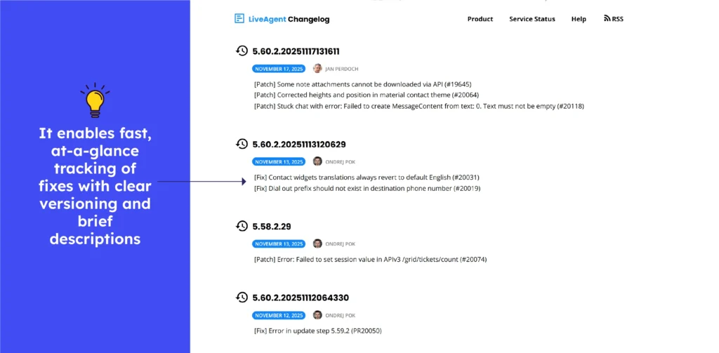
LiveAgent’s changelog is a real-time upgrade report with a clear date for each feature, fix, and improvement. It makes scanning updates simple and keeps support teams on track. It highlights LiveAgent’s ongoing commitment to precision and continuous improvement in a single “what’s new now” feed.
What to emulate: Transparent and regularly updated logs foster trust and encourage adoption, while clear date tagging simplifies tracking.
What to avoid: If entries are too technical or concise, people outside support teams may miss out, a brief note would help wider audiences.

Release notes examples of Sales & marketing tools
25. HubSpot
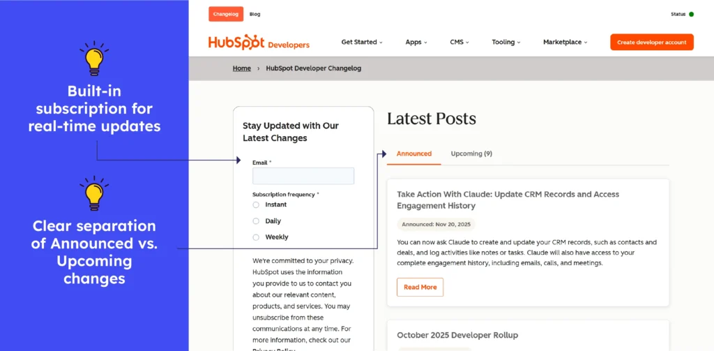
HubSpot’s Changelog is a frequent tech bulletin, with each API tweak, enhancement, and fix appearing as soon as they are released, providing developers with instant insight into what’s new.
Entries are neatly dated and clearly titled, making it simple to search for changes that affect integrations. It highlights HubSpot’s ongoing evolution, including new endpoints and removals.
What to emulate: The order-based and date-tagged format simplifies tracking, while concise release notes build trust and enable smooth integration updates.
What to avoid: Long entries without brief summaries can be stressful. A synopsis would make it easier to read.
26. Mailchimp
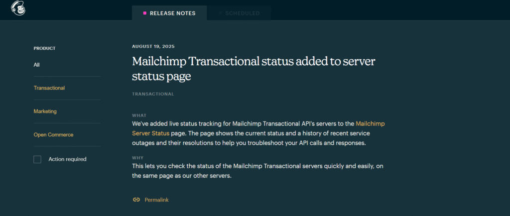
Mailchimp Release Notes suggests an existing developer logbook. Every update and new feature is visible as soon as it goes live, providing developers with real-time information about what’s new and why. Each log is dated and titled, allowing readers to quickly identify changes that affect their integrations or campaigns.
It shows Mailchimp’s commitment to consistent innovation, as well as an always-on integration pulse that includes everything from new endpoints to fixes and changes.
What to emulate: Timely and well-organised entries with clear versioning enable developers to adapt quickly.
What to avoid: Avoid updates that dive straight into heavy technical terms without a quick and plain-language note. It will be difficult to understand why the change is necessary.
27. Zoho
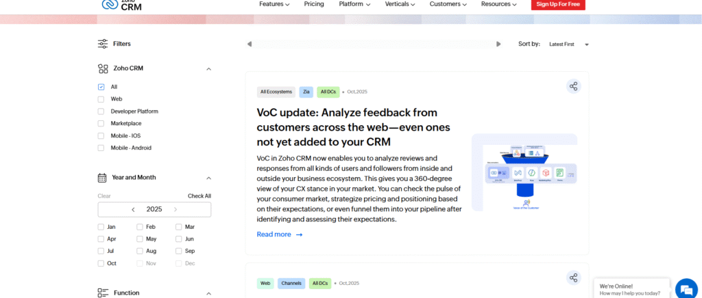
Zoho CRM’s Release Notes includes product log, thoroughly documenting every update, fix, enhancement, and new feature. Teams can quickly filter what is important using time-stamped entries arranged by labels, topics, editions, and years. It functions as a smart update tracker, displaying the platform’s continuous growth.
What to emulate: Rich filters, structured entries, bold headlines, and clear categorisation make updates simple to locate and follow.
What to avoid: Long descriptions may annoy readers, but shorter and context-first summaries could enhance simplicity.
28. Buffer
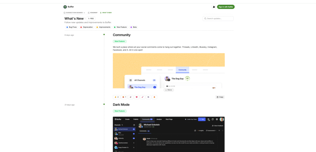
Buffer’s Changelog offers a clear update stream, with each fix, improvement, and feature swiftly logged. Users can filter updates based on bug fixes, deprecations, improvements, new features, and beta items, making it simple to track what affects their workflow.
What to emulate: Use clear categories and timely entries to allow users to quickly filter updates and understand changes without having to search.
What to avoid: Ignore overly short notes that lack context, as they leave users unsure of the impact and reasoning behind each update.
29. Hotjar
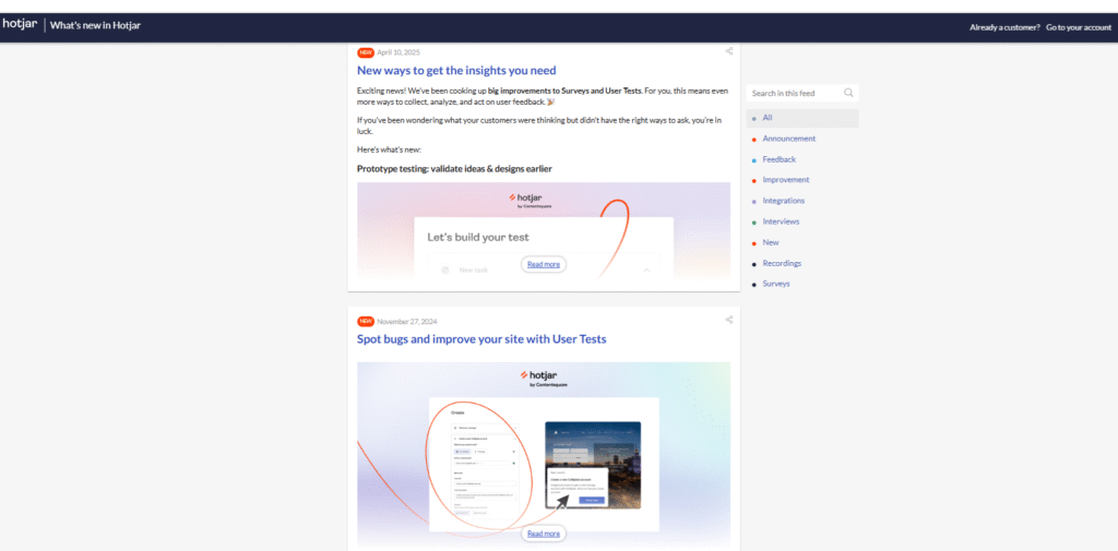
Hotjar’s Release Notes updates provide a product tracking system, capturing each feature release, improvement, integration, and fix in a clean, timely sequence.
Each update is clearly tagged for easy scanning, and the right-side feed allows users to search or filter by categories like announcements, feedback, improvements, integrations, new, surveys, or recordings. It makes the system effortless to navigate and track what matters most.
What to emulate: Provide clear and well-tagged categories and filters so that users can easily find updates relevant to their work.
What to avoid: Remove cluttered or unstructured update lists that force users to scroll indefinitely before finding what they need.
30. Sprout Social
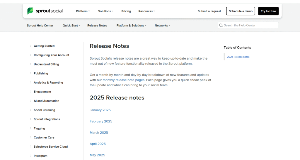
Sprout Social’s Release Notes document every update, new feature, enhancement, and bug fix, providing users with a clear picture of platform changes. Each update is clearly dated and organised to help users in tracking improvements and functional changes.
Every team is kept in sync by the page’s constant updates, which include design modifications and new features.
What to emulate: Consistent and dated entries and clear update types assist users in identifying relevant changes and staying informed.
What to avoid: Stop publishing overly broad or highly technical update entries without clear context. Users may become confused if the reason for the change is not explained.
31. Moz
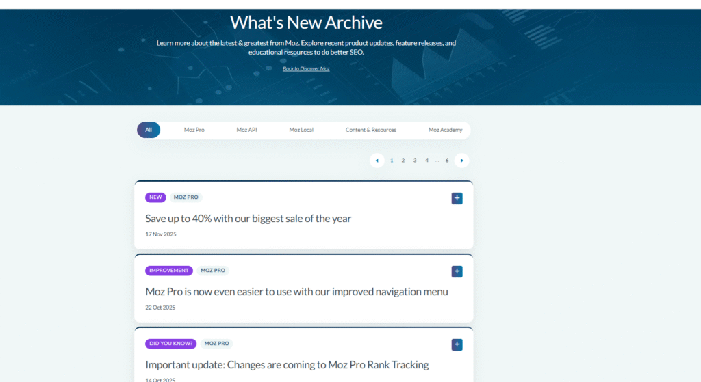
Moz’s “What’s New / Archive” page works as a comprehensive update log, documenting product launches, improvements, bug fixes, and blog announcements. Each entry is timestamped and labeled, providing insight into platform updates and SEO tool improvements. Whether it’s a new feature, an algorithm update, or a performance tweak, it keeps users updated and helps them predict how Moz will change over the years.
What to emulate: Use dated and clearly labeled entries to help users track feature launches, updates, and changes over time.
What to avoid: Mixing unrelated updates in a single feed without separating them by product or feature can be difficult to understand.
32. Convertkit
ConvertKit’s release notes provide a clean, timeline-style stream of updates that include dates, tags, and visuals. The updates make it easy for users to restore versions, track edits, and recover drafts, with clear explanations and screenshots that make changes immediately understandable.
What to emulate: Clear tags, concise headlines, and visual context make updates scannable and help users grasp changes instantly.
What to avoid: Don’t use static screenshots, short GIFs, or micro-demos in every release. Instead, save space and provide detailed and simple updates.
33. Hootsuite
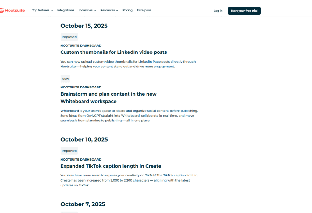
The Hootsuite changelog promises to keep social teams informed, and the “Product Updates” page does just that. It describes new tools, enhancements, and fixes in clear, simple language, allowing users to quickly understand what has changed or improved. Options to read more or test the feature directly are frequently available, making it simple to act on the updates.
What to emulate: Headlines are clear and user-friendly. It informs users of what’s new, often with no additional reading required.
What not to do: Avoid long single-page feeds. Instead, consider categorising updates into releases (e.g., “UI updates,” “Integrations,” “Bug fixes”).
34. Postmark
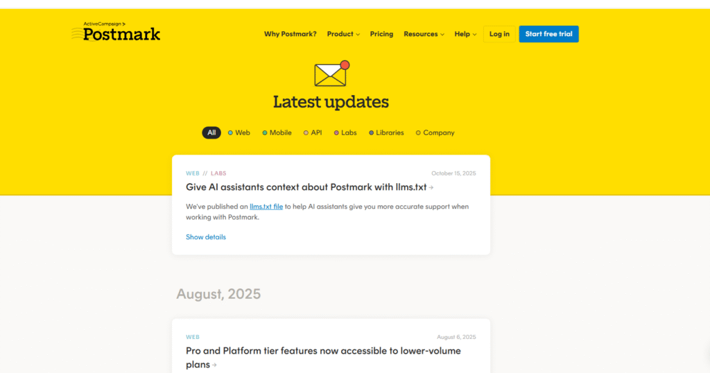
Postmark promises reliable, open email deliverability, and its updates keep users in the loop. Every new feature, fix, or enhancement is clearly announced, allowing users to understand what has changed or improved without using jargon.
What to emulate: Clear and user-focused headlines allow readers to quickly understand the value of updates, often without the need for additional reading.
What to avoid: Don’t use long and inconsistent update lists. To make scanning easier, organise changes by category (e.g., features, fixes, improvements) or year.
35. Vimeo
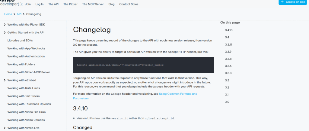
The Vimeo API is very clear for developers: a transparent and well-maintained video platform. Its changelog ensures that each update (new endpoints, fixes, and version deprecations) is clearly documented, allowing you to see exactly what changed. Updates are date-stamped and technical in nature, making integration and development easier.
What to emulate: Versioned and detailed entries allow developers to confidently track changes and seamlessly adapt integrations.
What to avoid: Ignore unclear or inconsistent change logs. Provide clear information such as changed endpoints, new features, and migration instructions.
36. Google search console
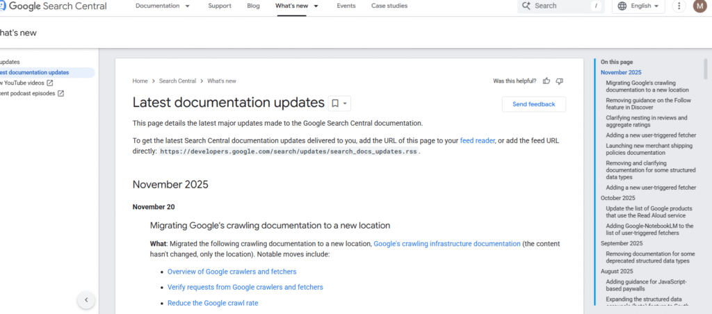
Google Search promises candor and clarity, and the updates page delivers. Every change to search algorithms, indexing, and features is openly documented so that users know what has changed. Updates are clearly dated and written in easy-to-understand language, allowing site owners and developers to stay informed of changes.
What to emulate: Public and dated logs with plain-language summaries allow readers to quickly understand what changed and why.
What to avoid: Don’t just describe updates with vague labels. Always provide context so that readers understand how the changes affect them.
37. Screaming Frog
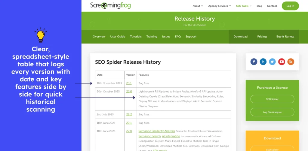
Screaming Frog SEO Spider’s release history lists each version with date and feature summaries (new capabilities like improvements and bug fixes). The chronological log, in spreadsheet format, allows users to track when specific features were added or fixed, simplifying version tracking.
What to emulate: Dated version entries plus a full log of features and fixes help users trace changes over time and audit releases easily.
What to avoid: Vast and continuous version lists with minimal visual breaks can make significant updates harder to spot, especially when scanning multiple releases at once.
38. Ahref
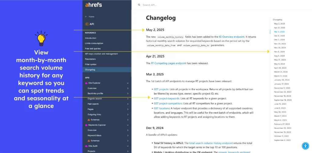
The Ahrefs API changelog tracks changes to endpoints, deprecations, and version lifecycles. It clearly indicates when API versions are no longer supported and includes information on how to migrate to newer versions. This allows developers to stay aware of breaking changes and expiry dates and plan accordingly.
What to emulate: Clear deprecation notices, version-sunset timelines, and grouped update categories help developers stay prepared, migrate smoothly, and understand API changes without unnecessary digging.
What to avoid: Major API shifts shouldn’t rely on brief notes. Adding short next steps or impact guidance prevents confusion and supports faster and safer integrations.
Release notes examples of Project Management Tools
39. Trello
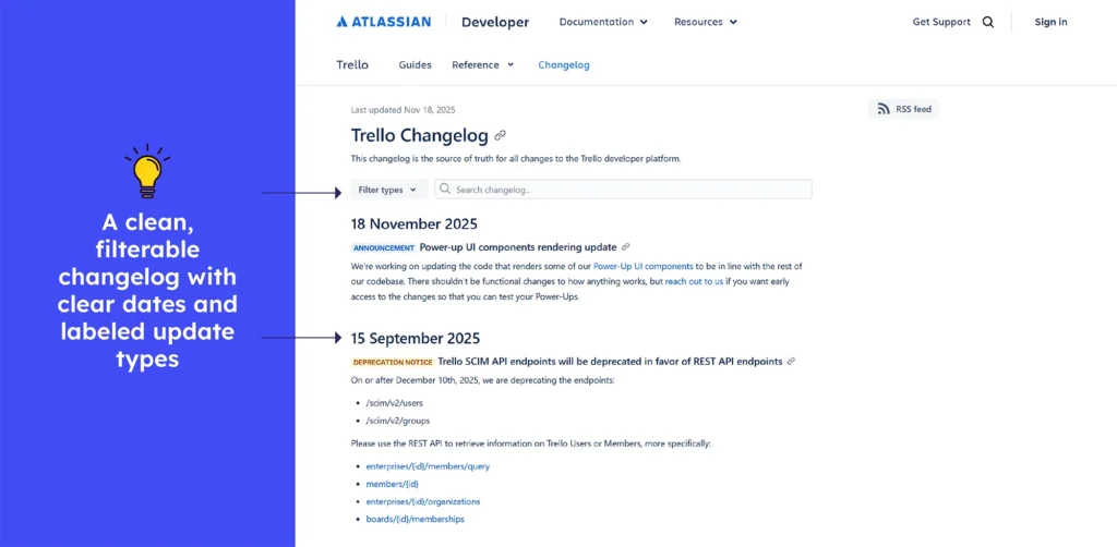
Trello’s Changelog is a clean and chronological update page that clearly documents every API addition, fix, removal, deprecation, or improvement.
Each entry is dated, titled, and easy to scan, and a detailed filter allows you to filter updates by Added, Removed, Deprecation Notice, Fixed, Announcement, Early Access, or Request for Comment, making navigation simple.
Developers gain a clear understanding of what has changed, why it matters, and how it will impact their integrations.
What to emulate: Clear titles, dates, and category filters allow teams to quickly understand changes and adapt with confidence.
What not to do: Avoid providing updates without context. Each entry should describe the impact or use case so that developers are not left guessing.
40. Jira
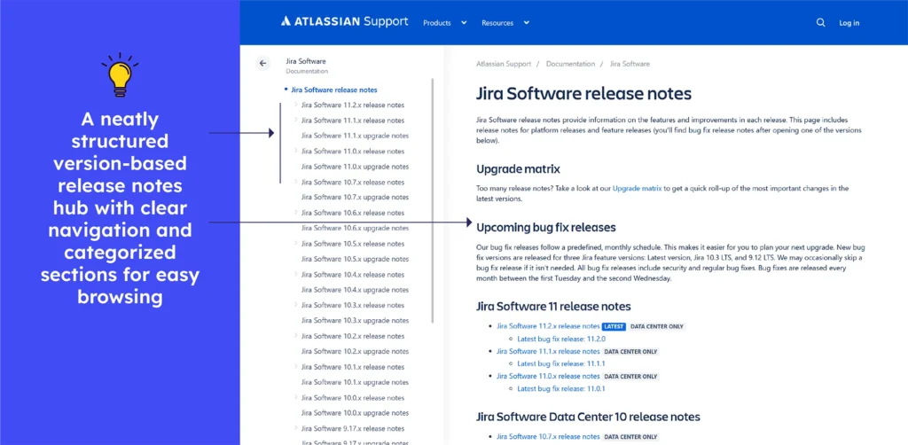
Jira Software’s release notes are structured as a clean, version-based log, with each update, from new features to bug fixes or enhancements, tagged with the version number and release date. Each entry is clearly labeled with its version number, allowing teams to quickly identify changes relevant to their upgrades. The structure promotes honesty and allows users to track changes over time, either for planning, migration, or feature adoption.
What to emulate: Versioned entries with dates and consistent formatting make navigating a changelog easy and reliable.
What to avoid: Stop combining multiple versions changes under one heading. Mixing updates can confuse users about when each change will apply.

41. Monday
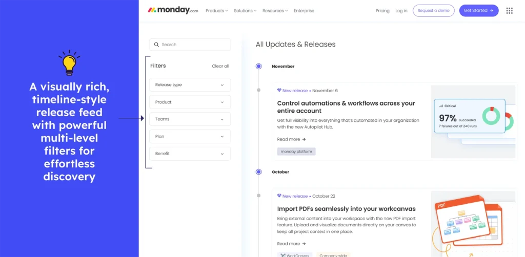
Monday.com’s “What’s New” page acts like a clean and ongoing product journal where every update from new features to workflow improvements. It is displayed with clear dates, short descriptions, and helpful visuals. The page lets users quickly scroll through what’s shipped or use filters to view categories like new releases, feature upgrades, and apps & integrations. This format helps teams understand how monday.com is evolving and how each change affects their daily work.
What to emulate: Clear timelines, visual cues, and category filters help users quickly navigate updates that matter to them.
What to avoid: Jargon and lengthy descriptions don’t provide context. Users can benefit from a brief “why it matters” summary.
42. Clickup
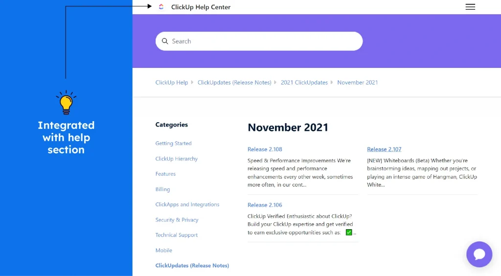
ClickUp’s changelog includes fresh update log, where new features, tweaks, bug fixes, and user-requested enhancements are listed chronologically. Each update includes a clear title, date, videos, and long description. Many entries include links to full release details or related discussions, allowing users to learn more or try out new functionality. This openness allows teams to see how it is changing and how feedback influences development.
What to emulate: Transparent, date-tagged updates with direct links to detailed notes and feedback threads.
What not to do: Avoid long descriptions, and make each update note clear about who benefits or is affected.
43. Airtable
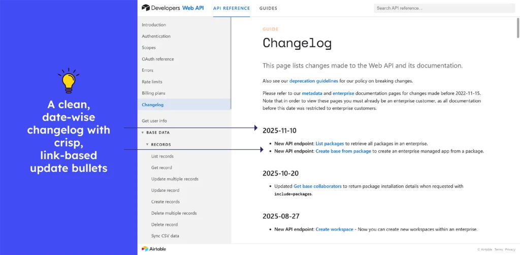
Airtable’s Changelog works as a clear logbook for developers: every change to endpoints, fixes, deprecations, or new functionality appears in chronological order. Each entry is dated, and many link opens directly to full API documentation or additional details, allowing developers to drill down for more context. This provides teams with clear visibility into API evolution, allowing them to confidently plan integration updates or migrations.
What to emulate: Date-tagged changes with direct links to documentation and details allow for smooth updates.
What to avoid: Skip change notes that are unclear or lacking context. Every entry should explain what changed and why it matters in a brief summary.
44. Smartsheet
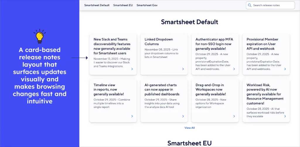
Smartsheet’s Release Notes is a product logbook, publishing each improvement, bug fix, and new feature as soon as it is available. Each update is dated with a clear headline and links to detailed release notes, making it simple to explore changes in depth. Every change, whether it’s a UI tweak, new integrations, performance upgrades, or expanded capabilities, is transparently documented. It’s your one-stop stream for change, helping teams stay updated and ready to leverage new functionality.
What to emulate: Clearly dated entries with direct links to deeper release notes make updates easy to track and understand.
What to avoid: Instead of a generic update title and jargon, a brief note on impact is preferable, even for minor fixes.
45. KissFlow
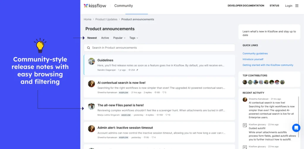
The Kissflow changelog shows each update clearly with a title, short description, views, likes, visuals, and comments. The chronological and clean layout helps users spot new features or fixes quickly. The posts combine user-friendly enhancements with technical improvements, making them beneficial to both businesses and users.
What to emulate: What to emulate: Grouped updates with clear titles and short summaries allow all users, both developers and non-technical, to see what changed and why at a glance.
What to avoid: When there are a lot of updates, it can get cumbersome. Significant changes may be overlooked in the absence of visual highlights or “major update” summaries.
46. Wrike
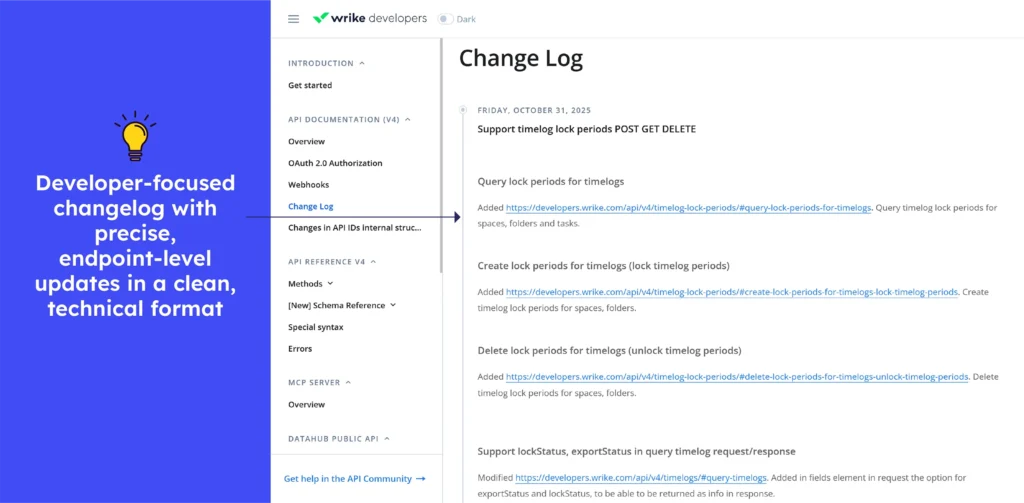
Wrike, like any other developer-focused platform, uses its Change Log to keep API users informed of updates. Each entry begins with a date and a descriptive heading, followed by a brief explanation allowing teams to adjust integrations over time.
What to emulate: Each update is easily understood due to clear and up-to-date headings and concise explanations. Explicit “action required” and deprecation notices assist integration owners in rapidly identifying changes that require immediate attention.
What not to do: When an update includes significant API changes (such as new scopes or deprecated fields), avoid providing only a two-sentence description. Provide a brief explanation so that developers know exactly what to adjust.

Release notes examples of Daily Usage Tools
47. Google Chrome
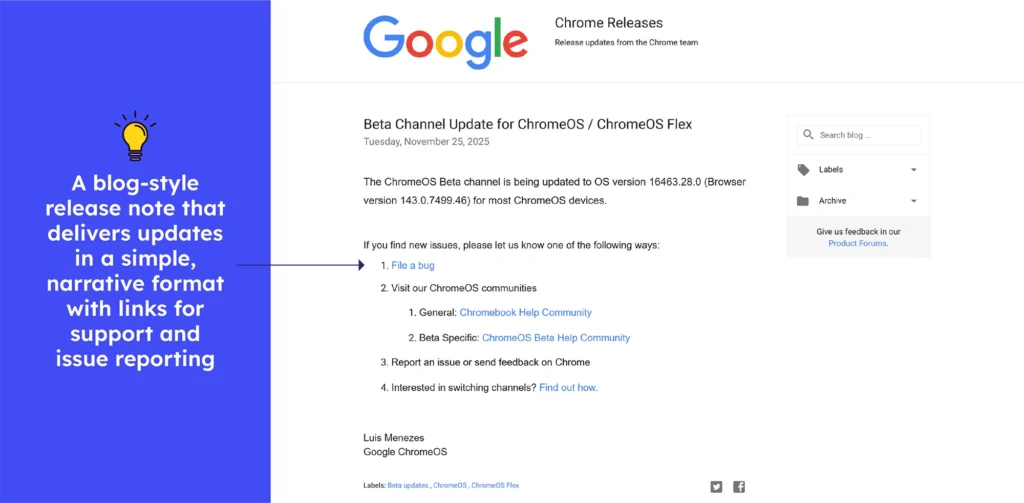
Chrome’s Blog Style Release Notes is a live board, with every browser update stable, beta, extended, or security-focused logged the moment it goes live. Each entry has a clear title, version number, and publication date, followed by links to technical details, security fixes, and component updates.
Users can quickly scan for what’s important or delve deeper into the linked documentation. This plan makes it simple for developers, IT administrators, and regular users to keep up with changes in Chrome’s ecosystem.
What to emulate: Precise versioning, consistent tagging, and direct links to more detailed technical notes all contribute to a secure and trustworthy update flow.
What not to do: Try to avoid scattering information across multiple pages. The single-entry format can ensure clarity without needing extensive instructions.
48. Dropbox
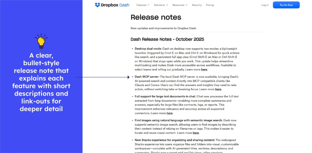
The Dropbox Dash release notes read like a full product journey, not just a changelog. The combination of concise summaries, layered feature sections, and deep-dive “Learn more here” links transforms the notes into an experience that takes users from discovery to understanding.
Every headline focuses on what the update means for users: faster search, richer context, smoother organisation, or smarter security.
What to emulate: Clear structure, strong user-focused highlights, and deep-dive links that make even complex monthly upgrades easy to understand.
What not to do: The volume of updates may appear heavy for quick readers, but depth and detail can provide significant value overall.
49. YouTube
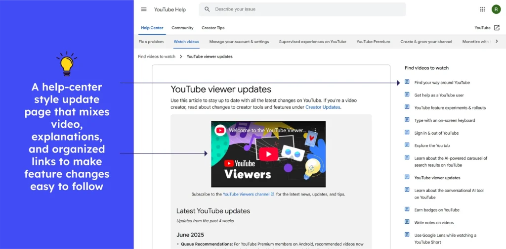
The latest YouTube updates deliver information in a compact, approachable way, even when multiple features roll out together. Each change begins with a clear headline, followed by a brief, value-driven explanation of what’s new, how it works, and why it’s important. Despite covering multiple updates, everything remains readable in a few lines per feature.
What to emulate: Monthly releases are neatly summarised, with the most significant improvements compressed into a single and clear paragraph that is simple to scan.
What to avoid: Get rid of cluttered layouts, vague headings, and scattered updates that force users to hunt for essential changes instead of seeing them instantly.
50. Telegram
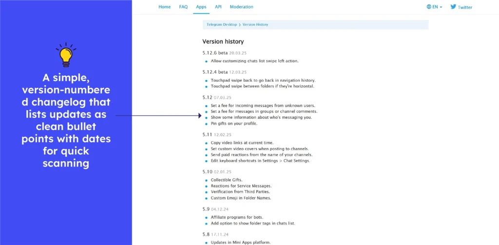
The Telegram changelog delivers updates in a clean, chronological flow, highlighting meaningful improvements with short bullet points and user-focused one-liners. Each version is simple to scan, displaying what’s new, how it works, and why it’s important, making updates simple to understand.
What to emulate: The changelog classifies updates chronologically and describes new features in clear, user-friendly language, making even complex changes simple to understand.
What to avoid: Don’t bore users with long and unorganized lists. Skip long sections of text and instead present updates with clear headings and bite-sized summaries.
51. Grammarly
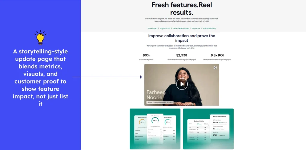
Grammarly release notes read like a clean, structured progress log, with updates organised by theme and each change explained in a few focused lines. Grammarly’s updates, which range from multilingual support to advanced AI agents and enterprise-grade analytics, are always designed to benefit users and teams. This approach makes even complex enhancements understandable at a glance.
What to emulate: Clear and benefit-driven categories simplify updates, allowing users to quickly understand improvements across languages, AI tools, and enterprise features.
What to avoid: Multiple simultaneous upgrades can be stressful. Structured grouping can make the experience mostly simple and manageable.
52. Medium
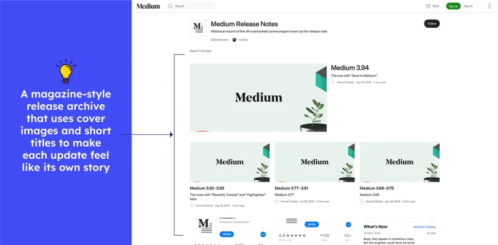
The Medium release notes are a playful chronicle, not just a dry list. Each update condenses bug fixes, performance enhancements, and feature changes into short, easy-to-read entries.
The updates are grouped by version but stay brief and readable. It provides users with a consistent overview of improvements while maintaining Medium’s creative, informal tone.
What to emulate: Use short and version-grouped updates with concise explanations that are clear, readable, and consistent with the product’s voice.
What not to do: Avoid hiding important updates behind lighthearted content that ignores actual improvements and user benefits.
53. Chatgpt
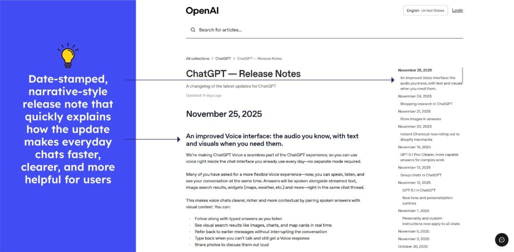
ChatGPT’s release notes present updates in a clear chronological order, with each entry dated and titled by feature. Every update includes brief summaries that describe what changed, ranging from richer voice and visual chats to improved models. There are also new subscription features that enable users to track new capabilities and understand their impact.
What to emulate: The mix of dated titles, quick summaries, and clear availability notes creates an easy-to-skim timeline that helps users grasp updates instantly.
What to avoid: When updates are many and frequent, the list can get long and tedious. Implementing tiny “highlight boxes” for major changes (e.g., “New model launched,” “Voice + visuals now live”) would make them pop out.
54. Google Drive
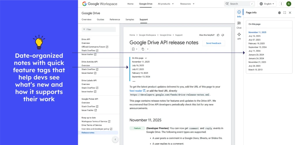
Google Drive release notes include clear and date-stamped entries that describe new features, API scope updates, and deprecated behavior. These entries are arranged under headings such as “Feature,” “Change,” and “Announcement,” allowing developers to quickly scan recent changes and adapt integrations accordingly.
What to emulate: Timestamped entries with clear headings and grouped change types make tracking API updates easy and transparent for integration teams.
What to avoid: Skip long and unbroken logs. Without a highlight section, important permission or deprecation information can become lost in the sweep.
Release notes examples for other tools
55. Smplrspace
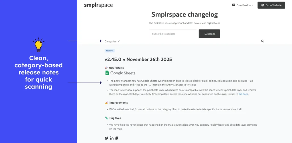
Smplrspace’s release notes are straightforward and consistently updated, with clear versioning, dates, and neatly grouped sections for features, improvements, and fixes. Each update is concise and linked to relevant documentation, making it easy for users to scan changes quickly. The chronological layout supports accessibility and helps teams track product evolution effortlessly.
What to emulate: Clear categorisation, concise bullet points, and consistent versioning with dates make updates simple to scan, enhancing readability and user understanding.
What to avoid: Long and uninterrupted pages can be difficult to read. Add brief impact summaries to help readers grasp major changes quickly without scanning every detailed update.
56. Molecule
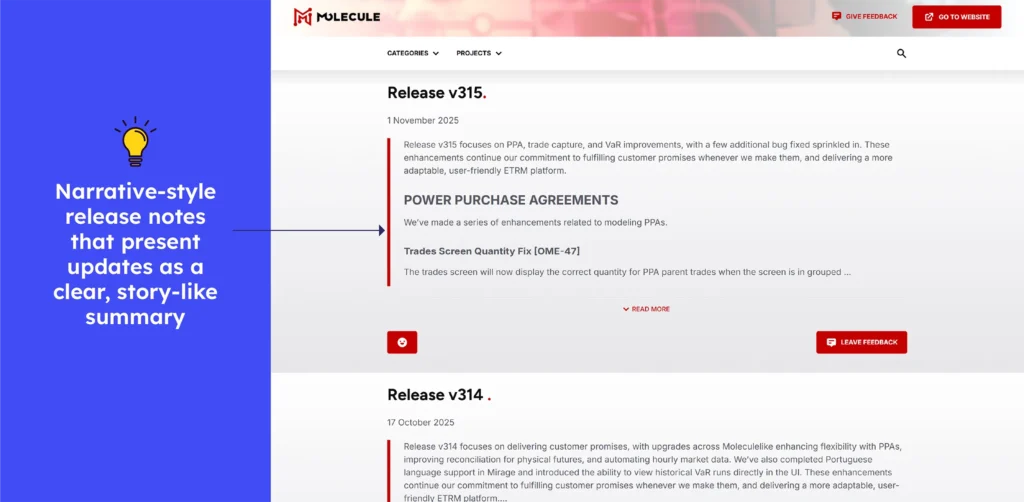
Molecule’s release notes are clean, frequent, and effective, with clear dates and structured sections highlighting new features, improvements, and fixes. Each release is short, scannable, and written in simple language, helping users quickly understand what changed. The consistent formatting and chronological order make tracking product progress simple and clear.
What to emulate: Consistent layout, simple language, and neatly grouped sections make updates simple to understand while maintaining clarity and transparency with each release.
What to avoid: Instead of presenting all updates continuously, short impact highlights would speed up understanding of important changes and cut down on reviewing time.
57. ePages
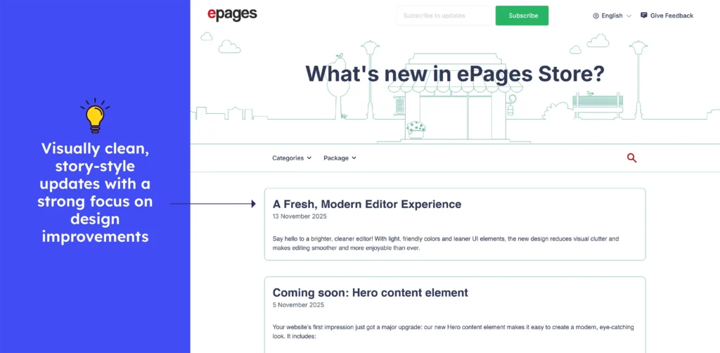
The ePages Store release notes are nicely formatted and regularly updated, with clear dates, version-agnostic headings such as Features / Improvements / Bugfixes / App, and concise, user-focused descriptions. Each entry summarises what changed, from a modern editor UI to AI-assisted setup, allowing users to quickly understand updates.
What to emulate: Use clear categories and simple, benefit-focused descriptions to help users scan releases and understand new value quickly.
What to avoid: Don’t dump every update without context. Adding a short “why it matters” line for major changes enhances clarity and user relevance.
58. Textkernel
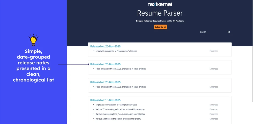
The Textkernel Resume Parser release notes are easy to read, with clear dates and version history. Updates include structured entries such as “Enhanced: Improved normalization of ‘staff physician’ jobs” or “Improved PDF-to-text conversion.” This structured format allows users to quickly understand parsing improvements and track changes in chronological order.
What to emulate: Use clear, version-dated entries with grouped changes and concise “Enhanced/Fixed” labels that make tracking updates simple and transparent.
What not to do: Avoid publishing releases without short impact summaries. Adding a quick “key improvements” highlight would help users grasp important changes faster.
59. Clockify
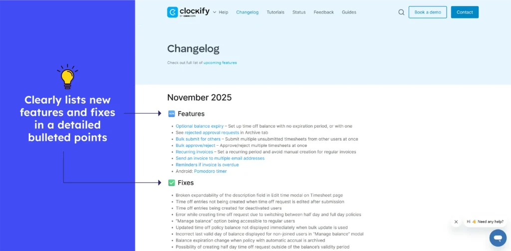
Clockify’s changelog presents updates chronologically, grouped by month, with clear “Features” and “Fixes” sections. Bug-fix notes accompany feature updates, allowing users to quickly see new capabilities and resolve issues.
What to emulate: Segmented updates (Features/Fixes) under dated headings provide clarity. The combination of improvement and bug-fix logs provides a comprehensive overview of ongoing enhancements and maintenance.
What to avoid: Don’t let long logs bury recent updates. To avoid overwhelming users with too many previous entries, highlight recent or significant changes so that they stand out.

Conclusion
Writing a good release note can also prove helpful to internal teams and improve collaboration in the organization. Following release notes best practices can save some time crafting helpful release notes. Managers in charge of release notes shouldn’t just focus on getting them ‘done’ but put some thought and effort into tying the product’s story to user needs through release notes.
FAQs
1. How often should release notes be published?
Release notes should be published every time a new version, update, or significant change is released, ensuring users are kept informed in real-time.
2. Where to publish your release notes for maximum impact?
Publish them on easily accessible platforms like your website, product dashboard, customer support portal, and community forums to reach the widest audience.
3. How to write effective release notes?
Focus on clarity, brevity, and relevance highlight key changes, improvements, and fixes in user-friendly language.
4. What’s the best way to structure release notes for clarity?
Organize them into sections like New Features, Improvements, Bug Fixes, and Known Issues so readers can quickly find the information they need.