
Product Delivery Dashboard Report
Turn ongoing delivery work into a single executive
dashboard, removing the need to ask engineering for
an update.
What is a Product Delivery Dashboard Report?
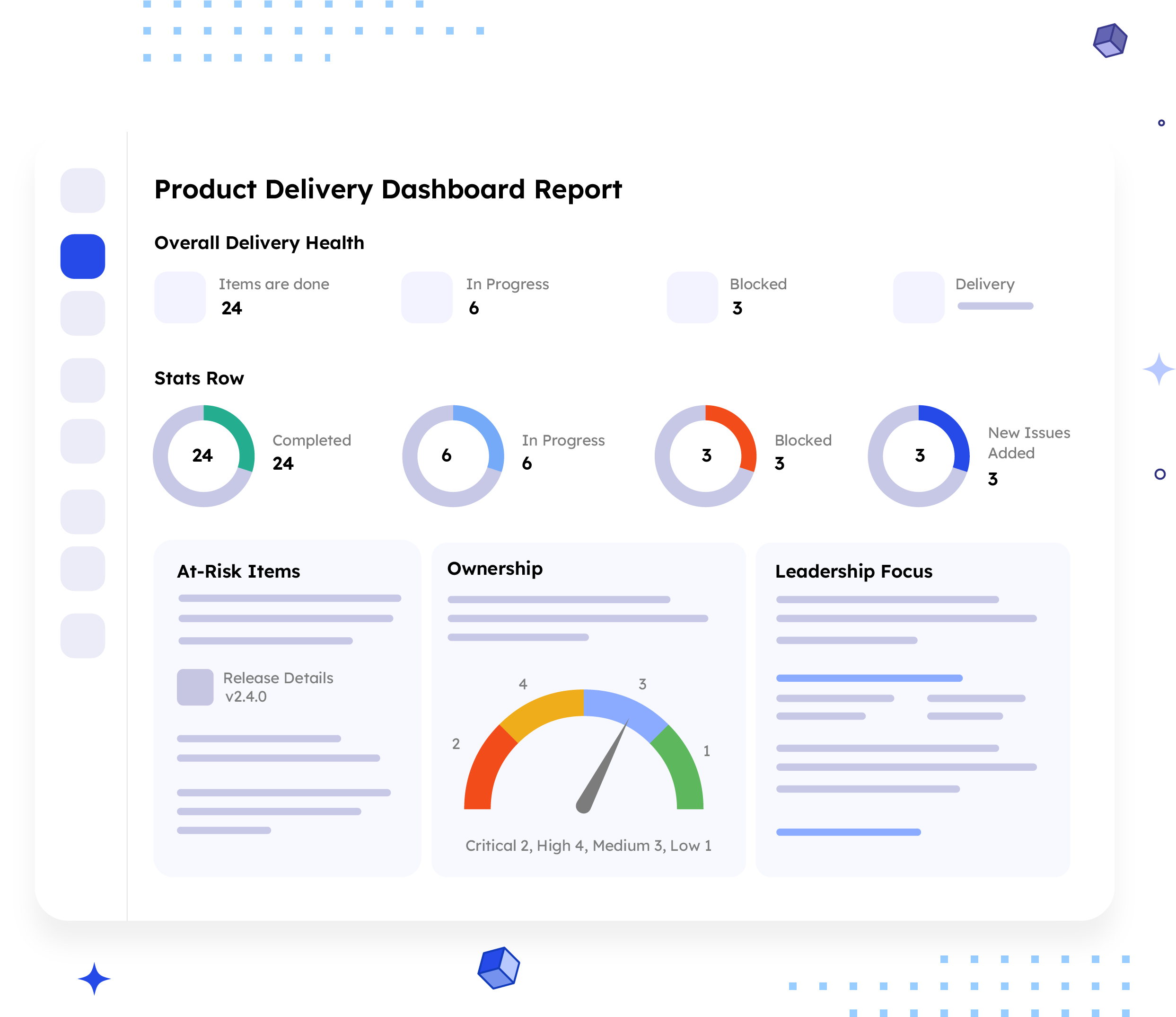
A Product Delivery Dashboard summarises delivery health for leadership in plain language. It covers
overall status, completion trend, and at-risk items, all in one view. It concludes by naming the one
decision that leadership must make right now.
This isn't a per-release report. It's a standing view of how delivery is trending over time. It answers a
different question than the Executive Release Summary, not the question of “how did this release go,”
but the question of “how is delivery going right now?”
Who should receive it?
Anyone responsible for delivery outcomes, not day-to-day execution.

Executives and leadership
Wants delivery of health and risk in plain, jargon-free language.

Product
leadership
Uses it to spot a slipping trend before it becomes a missed commitment.

Founders and
board members
References it as a clean, non-technical view of delivery performance.

PMO leads
Uses it to confirm delivery metrics line up with portfolio-level expectations.
When should it be sent?


On a recurring
cadence
weekly, as the standing pulse check on delivery health.

Ahead of
a leadership sync
so executives arrive already knowing the trend.

When blockers
spike
flagged early, before it becomes a bigger conversation later.

When a priority item
goes unresolved
surfaced here before it needs escalation.
Essential sections, with examples
Six sections, moving from overall health to the one decision leadership needs to make.

Overall Delivery Health
Four to five plain sentences naming actual counts, the biggest win, and the biggest concern.
Example:
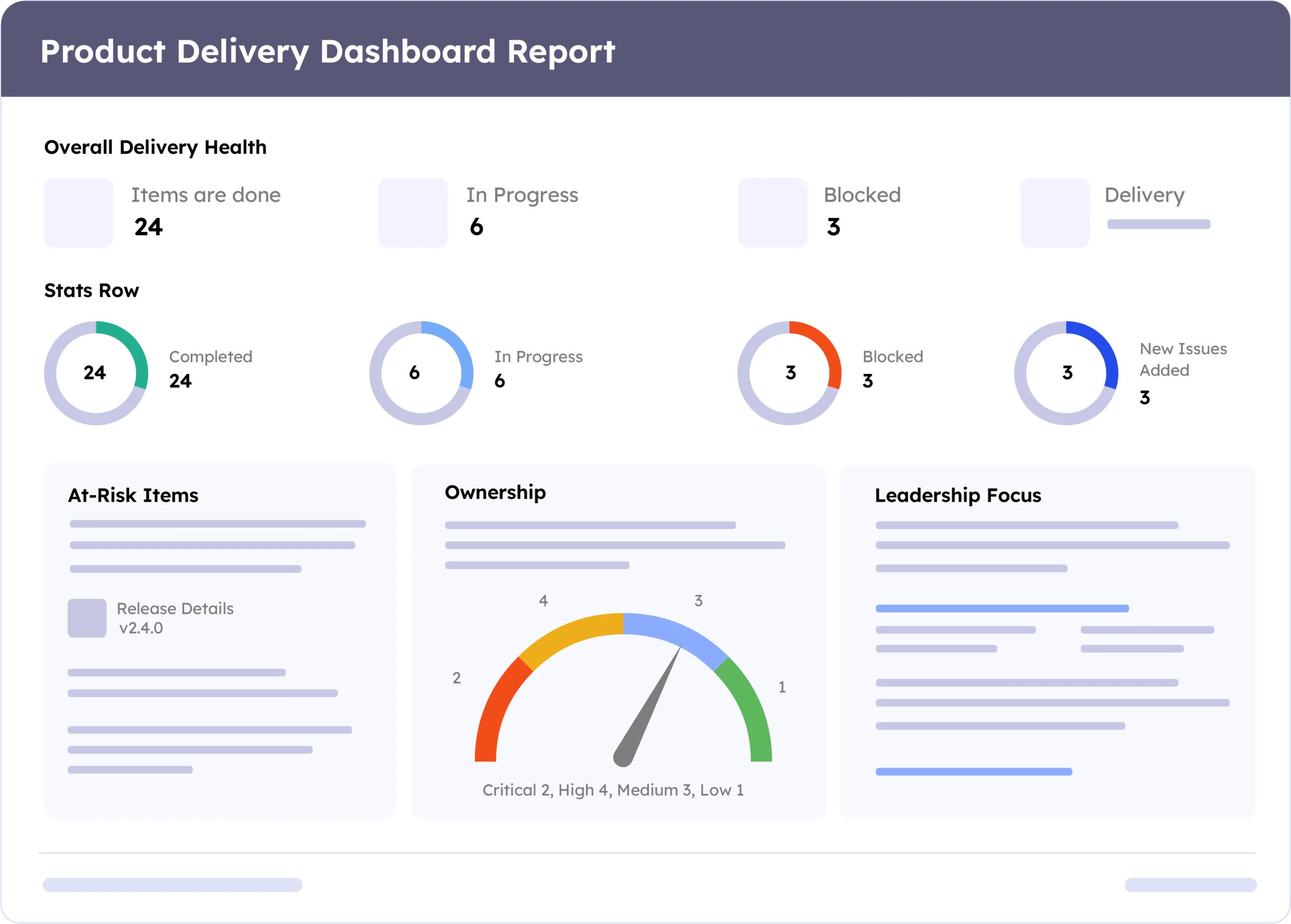
"24 items are done, 6 are in progress, and 3 are blocked. Delivery confidence remains steady."

Stats Row
Completed this period, currently in progress, blocked or flagged, and new issues added.
Example:
24 Completed, 6 In Progress, 3 Blocked, 3 New Issues Added

Completion & Blockers Trend
Comparing this period against the last, stating direction and the exact change.
Example:
"Completions rose from 20 to 24 this period. Blocked items held steady at 3."

At-Risk Items
Blocked or overdue issues grouped by assignee, with key, summary, priority, and status.
Example:
PROJ-101, Fix login timeout on mobile Safari, High, Jane Doe, In Progress.

Active Work by Priority
A bar chart of open issues grouped by priority, so volume by urgency is visible at a glance.
Example:
Critical 2, High 4, Medium 3, Low 1

Leadership Focus
Naming the single area needing a decision now, with a recommended next step.
Example:
"Checkout has the most unresolved high-priority items, 4 open. Confirm the fix timeline with Jane Doe this week."
Common mistakes

Vague health language.
"Things are moving well" tells leadership nothing they can act on.
No specific counts.
A trend with no number attached leaves leadership guessing how much changed.
Skipping the assignee on
at-risk items.
A blocked item with no owner just sits there.
No single leadership focus named.
A full metrics list without one clear priority buries the real signal.
Updating on an inconsistent cadence.
A dashboard leadership can't rely on stops getting opened.
Example report
A real report, recreated here from a live ARNR export. Swap in a full screenshot once the final export is ready.
How to automate it with ARNR
Three steps replace the manual work of building a delivery dashboard by hand.
Connect Jira
Link your Jira project to ARNR. It reads status, priority, and blockers directly.
Pick the cadence
Choose weekly or monthly refresh and select this template from the library.
Get your dashboard
ARNR calculates the trend, flags at-risk items, and names the leadership focus area.
Related report templates

Executive Release Summary
Leadership briefing per release

Cross-Project Release Notes Report
Multi-project
rollup

Confluence Release Pages Report
Shared organisation wide summary
Risk
Report
Deep dive