Ask a Gantt chart a question and it always has an answer ready.
When does design finish? March 14. What comes after testing? The launch. How long is this phase? Six weeks.
Fast, clear, no hedging. That’s what makes it such a good tool — and what makes it so easy to trust further than it deserves.
Because there’s a second set of questions the chart seems to cover but doesn’t. Are these dates realistic? Is anyone buried? What happens if we’re wrong about one of them? On all of that, the chart says nothing. And silence is easy to read as “nothing to worry about.”
Five quiet spots, then. Not an argument against Gantt charts — they earn their keep — just a clear look at where the map stops.
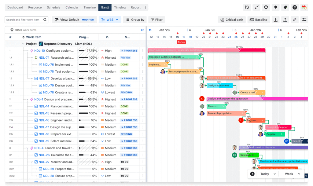
5 things Gantt charts hide from you
1. Confidence doesn’t show up on the chart
Every bar has the same crisp edges. A task your team has done a dozen times looks exactly like one nobody has ever attempted. Same shape, same colour, same air of certainty.
Those are completely different animals. One is a measurement. The other is a hope in a nice suit.
It matters most when other work sits behind the guess. A shaky estimate near the front of a chain doesn’t stay shaky — it quietly hands its uncertainty to everything downstream. By the time anyone notices, four tasks have moved instead of one.
Try this: find the tasks nobody has done before and mark them — a tag, a colour, a note, anything. Give the worst ones a range instead of a fixed date, or a visible buffer behind them. You’re not chasing accuracy. You’re making sure the guesses can’t pass themselves off as facts.
2. The chart schedules tasks, not people
Three bars side by side look like progress. They can also be three jobs belonging to the same person.
This is the gap that catches teams most often, because nothing looks wrong. Parallel bars read as “happening at once,” but that only holds if the humans involved can actually do them at once. The timeline never checks.
So the plan is impossible in a way nothing highlights. No warning, no red flag. Just someone quietly at double capacity, and then a week where everything they touch slips together.
Try this: once a week, read the chart by person instead of by date. Some tools do it for you — TeamBoard ProScheduler, for instance, gives each person a row and colours their week by load, green for balanced and red for over-allocated, so the collision shows up while you’re still planning rather than in week six. No view like that? Scanning manually takes five minutes and still catches the expensive ones early.
3. Everything is the same size on the page
A Gantt chart speaks one visual language: the bar. Length is duration, position is timing, and importance is… nothing. There’s no way to say “this one is the whole project” and “this one is polish.”
Fine, until scope has to shrink. And scope always has to shrink. At that point you need a fast, shared answer to what goes first — but the chart offers none, so the call gets made by whoever argues hardest, or by whatever’s easiest to delete.
Quick test: if someone asked you to drop a fifth of the work by tomorrow, could you answer in ten minutes without booking a meeting? If not, priority is still living in someone’s head.
Try this: tag tasks must-have, should-have, nice-to-have — then get those tags onto the chart itself. Most tools can colour bars by a field; ProScheduler drives it from a JQL query, so must-haves paint themselves one colour and the rest another. The wall of identical bars turns into something you can read at a glance.
One caveat: colour only reflects a decision someone already made. If nobody has said what’s essential, there’s nothing to paint. The tool shows your priorities; it can’t work them out for you.
4. Decisions leave no trace
Testing runs before the marketing push. Launch is the 20th. The blog migration went to phase two.
Every one of those was a real decision by real people who weighed something and chose. The chart kept the outcome and binned the reasoning.
For a few weeks that’s fine — everyone remembers. Then memories fade, new people arrive, and someone asks a completely fair question: why can’t we just move this? Nobody’s certain. Hard constraint or preference? Someone half-recalls a client thing. So you either re-argue a settled point or move it and discover the hard way why it was there.
Try this: keep a short decision log beside the plan. Two or three lines each — what we chose, why, what we gave up, the date. It feels like admin for about a month. Then it saves you the same argument four times and you stop questioning it.
5. “80% done” isn’t a measurement
Progress percentages are the softest numbers in project management. Self-reported, rarely defined, reliably optimistic — not because anyone’s fibbing, but because the hard part hides at the end.
The first stretch is building the obvious thing. The last stretch is edge cases, review comments, and the three problems nobody predicted. Which is why tasks sit at 90% for a fortnight while the chart cheerfully insists you’re nearly there.
There’s a quieter version too. “Done” means different things to different people — written, versus tested, versus actually live. Same bar, two readers, two conclusions.
Try this: agree what “done” means before work starts. One sentence covers it. Then ask for demos instead of percentages — watching the thing work tells you more than any number, and it’s much harder to be vague about. It also helps to save a baseline at kickoff, so you can see how far today’s dates have drifted from the ones everyone originally signed off.
Where this leaves you
Gantt charts are still the fastest way to show someone the shape of a plan. For deadline-driven work with real dependencies, nothing else communicates as much in as little time. That value is real and none of the above takes it away.
The fix isn’t a different chart. It’s to stop asking this one questions it was never built to answer.
- Uncertainty — make the shaky estimates look shaky
- Capacity — read the plan by person, not just by date
- Priority — decide what you’d cut before you have to cut it
- Reasoning — log the decisions, briefly, as you make them
- Progress — define “done” once, then ask to see it
Start with whichever one describes something that went wrong in the last month. That’s the one already costing you.
The better question
A useful Gantt chart isn’t one that turns out to be 100% right – nothing is reliably right about the future, and no tool changes that.
A truly useful timeline is one that everyone reads the same way, including agreeing on what it doesn’t cover. When a team knows where the map ends, the weekly conversation shifts from “Is the chart on track?” to “What’s actually in our way, and is anyone carrying too much?”